Finding a breakpoint
2026/08/30
A simple design
Often when designing for small screens, what is laid out in a simple grid of two columns can need to collapse down to a single column layout. Equally, if adapting a design for small screens to wider screens, those single column lists of items can be good candidates to expand to a two column layout. On desktop or large tablets and laptops, maybe 3 or 4 columns will make sense, but the problems from finding a breakpoint for 1 and 2 columns are largely the same so I’m not going to repeat everything for 3 and 4.
You end up with a design that has two columns
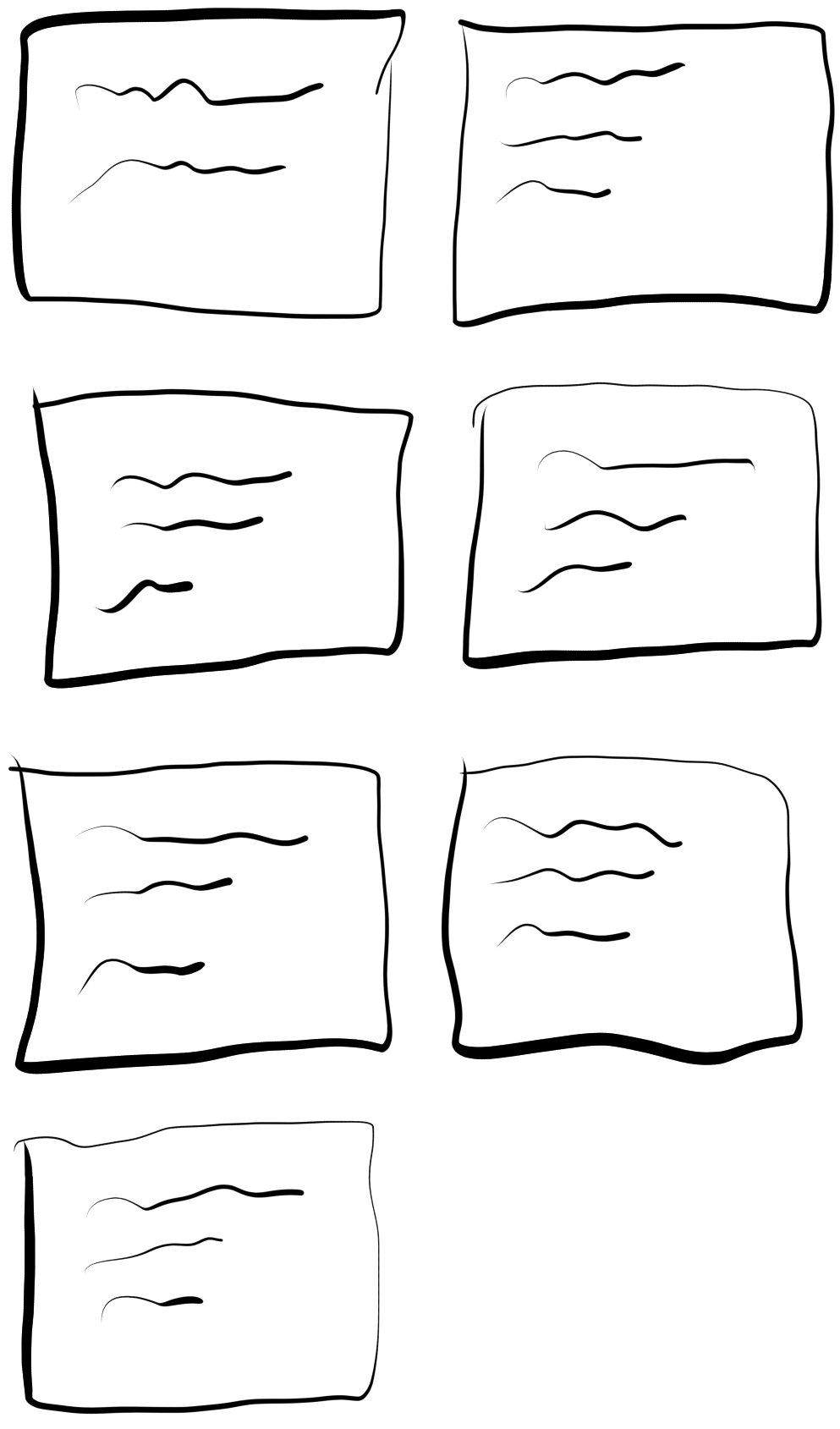
then at a certain point it needs to collapse down to one column.
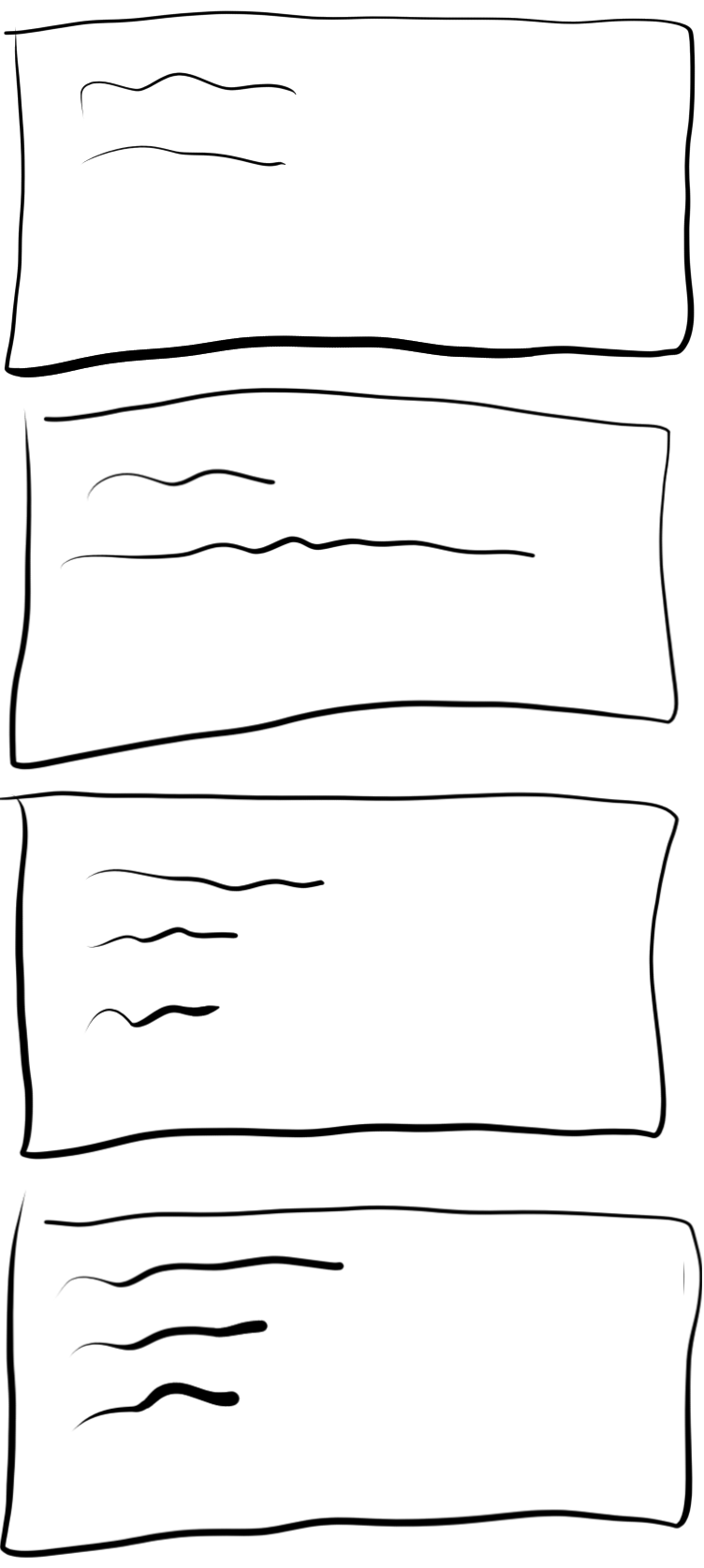
Easy right? Lots of modern UI frameworks let you define a grid and set the number of columns.
A simple solution
.container {
    display: grid;
    grid-template-columns: 1fr 1fr;
}

.card {
    margin: 8px;
    padding: 12px;
    background: lightblue;
}
Then we just put the cards in the grid and we have our two columns.
<div class="container">
    <div class="card">
        <p>A</p>
    </div>
    <div class="card">
        <p>B</p>
    </div>
    <div class="card">
        <p>C</p>
    </div>
    <div class="card">
        <p>D</p>
    </div>
    <div class="card">
        <p>E</p>
    </div>
</div>
A
B
C
D
E
We just find a breakpoint and switch to a single column layout by changing to grid-template-columns: 1fr.
A
B
C
D
E
and then we can set the breakpoint by resizing our window till we hit a point where the text is overflowing onto too many lines to be comfortably readable, then use a media query to swap between 2 and 1 columns at this view port width. Job done!
Sort of.
If you don’t need to cater to any users that have adjusted the font size on their device, then this approach works. It still ‘works’ even if some users do have larger fonts, your breakpoint is just wrong. Instead of preventing the text from overflowing onto too many lines by switching to a single column layout just before, with a larger font the viewport width breakpoint is too late and will switch to a single column layout later than you wanted.
Naive solutions
An obvious ‘fix’ at first is calculate your breakpoint using both the font scale and the width of the screen instead of just the latter. This is a lot more robust, but it too has limitations.
On modern Android devices and on iOS devices the font scaling is not linear. Body size text scales to larger sizes faster than already large title text. This is good for users because a large title that’s big without any applied font scaling doesn’t really need to double in size to help a user read it the same way smaller body text will. Regardless, this creates problems for calculating the breakpoint. You can’t just do width / font scale to approximate how many pixels your text will use as the text size is not simply multiplied by the font scale.
In my experience, for features where the breakpoint being perfect at avoiding too much text overflow isn’t a high priority, devs tend to be stop here and set the breakpoint based on the font scale, the width, or some simple function of both of them. It may be good enough and it’s a maintainable solution even with the flaws.
Pixel perfect solutions
However, depending on the UI framework you are using, you can sometimes find a better way to size the breakpoint.
In Jetpack Compose I have been spoiled by the TextMeasurer API. This helpful measurement tool lets you pass in the exact same String text, TextStyle, maxLines and other parameters you will be giving to the Text actually drawn. With a custom Layout you can know the exact maximum width constraints the text inside each card will be given. All togeher, this allows a shift from finding a breakpoint at a per screen level that’s highly coupled with the choice of text to put in each card, to a single solution that applies anywhere you use the component regardless of the amount of the screen allocated to it or the actual text on the cards.
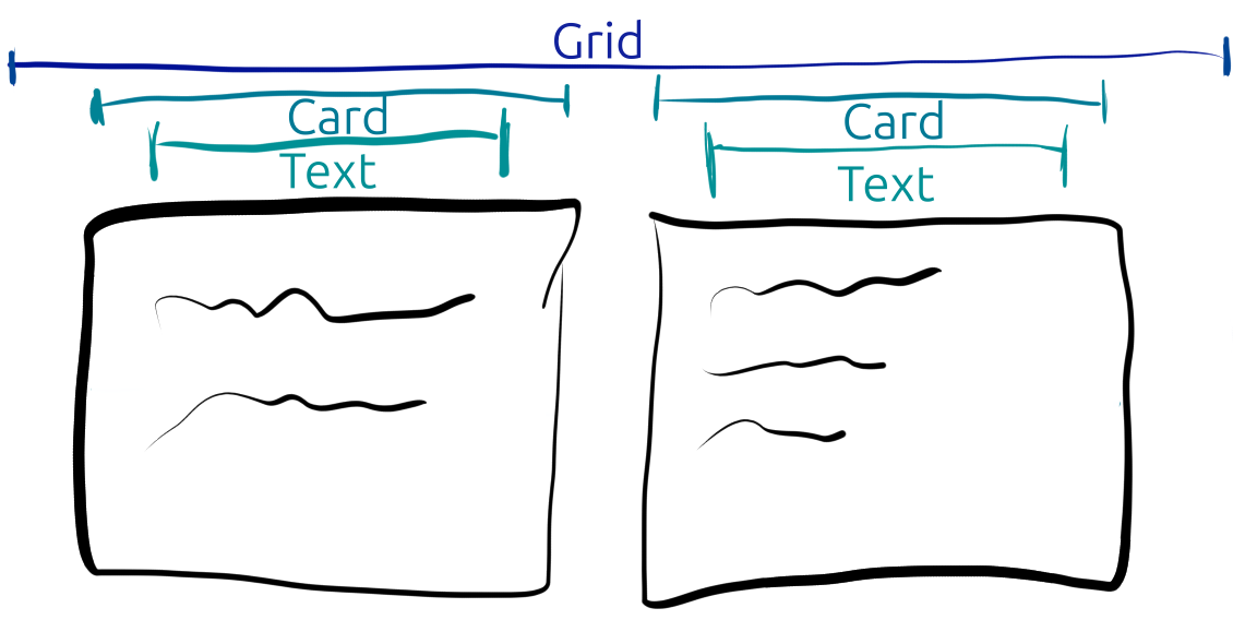
As shown visually, you can start with the width available to the entire grid. You can then consider if 2 columns will work by subtracting any margins between the columns or at the start and end. Then you have the space available per card, from which you can subtract the margins within each each and you have the maximum width 2 columns will afford to the text inside each card. Given a precise number of pixels that the text could be draw in, TextMeasurer can tell you if actually drawing the text there will overflow past a breakpoint of desired maximum number of lines. If the text would take up 3 lines and you don’t want to go past two then that’s your breakpoint, so if the text will overflow to a third line or more you can decide to opt for a single column layout.
Because this approach measures text instead of inspecting the text drawn in the two column layout, it doesn’t require multiple passes, and it is robust to the width given to the grid component changing while the grid is visibile. A user resizing the app on a tablet can trigger the breakpoint to switch back to 2 columns from 1.
If you have a native Android app, you may also want a native iOS app. I’ve not had much luck finding a general purpose solution in SwiftUI which is as developer friendly as Compose. For the specific case of wanting all the text in your card to fit without any overflow at all, ViewThatFits works very nicely, you can tell it to check only along the horizontal axis, and it will collapse from the two column layout to the one column layout as soon as any text in the card goes past the end of the line and causes the overall card view to not fit on two columns. If you want a breakpoint for going past 2 lines instead, it is possible to fall back to the Core Text APIs and use CTFramesetterSuggestFrameSizeWithConstraints which does give you the actual height some text will take up without drawing it. Alternatively CTFramesetterCreateFrame returns an object that tells you how many lines of text are needed. Both of these APIs have the limitation that their inputs are not the same as what you will pass to the Text drawn on screen. You will have to manipulate the attributed string given to the framesetter object to set equivalent paragraphing and if you don’t get a perfect match there could still be disrepancies from rendering differences that throw the calculation off. Even with slight inaccuracies, this will likely be more accurate than width / fontScale approaches because it does factor in the non linear font scaling.
Finding a solution on the web to measure text ahead of drawing it is left as an exercise to the reader.
Shameless plug: to access edge cases like vastly different text displayed in your app’s cards more easily, you may want to check out Mockzilla.